This article is more than 5 years old.
In a first attempt at creating a more mobile-friendly website*, I have just released a significant update to the home page.
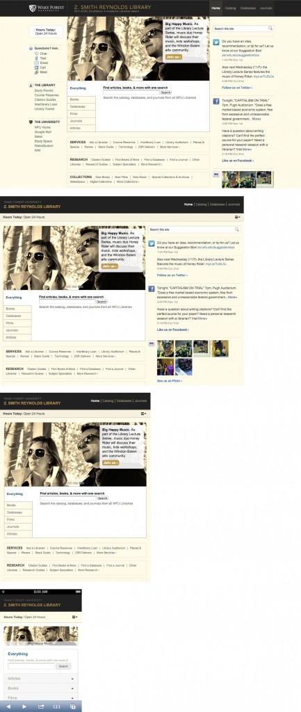
With the help of the web committee (Anna, Chris, Kaeley, Lauren, and Rebecca) to test and discuss changes throughout the process, I have worked to establish a similar user experience across a range of devices. While the home page will look (and function) as it has on laptops, the changes take effect on devices (and screens) with smaller resolutions, e.g. smartphones, tablets, and e-readers. I should mention that no content disappears for any device; it gets shifted or takes another shape depending on the resolution context.
Take a look at the changes in this selection of screenshots (click the image to view larger):
To see these mobile-friendly changes for yourself, visit zsr.wfu.edu on your smartphone.
While the changes apply only to the home page at this point, I hope to push out updates to additional pages over the next few weeks. Larger goals – creating a more mobile-friendly interface to the catalog or the study rooms app – will require more time and testing.
As always, let me know of any problems, concerns, or suggestions.


10 Comments on ‘A New (Mobile) Home Page’
This is so exciting, Kevin! Thanks for bringing responsive design to our website!!
Oh, I can’t wait to test this out at home on our tablets!
Nice! Thanks Kevin and the web committee!
Kevin and committee! I love the way the site looks on my iPhone! Kudos!
Wonderful work! Thanks, Kevin.
Good work all!
It is so much easier to do stuff from the home page on my smartphone now! It also looks really good on the Kindle Fire. Way to go, Kevin and committee!
iPad version is beeyootiful!
We have the best web team in the universe. Calling it.
Way to go!