This article is more than 5 years old.
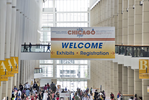
ALA Annual Conference 2013 @ McCormick Place, Chicago
I always prided myself (not sure why, but that’s probably just another of my issues) on staying on top of daily conference posts on this professional development blog. I find that I am better able to relay information in short spurts (hmm, maybe it’s my newspaper background in play?). And, I will admit to all of you who know me well, that I experienced some small sense of failure when I saw Hu’s Saturday conference post and read Lynn’s comment “you win the prize for the first ALA post”! I think I have fallen victim to the pervasiveness of social media that makes it so simple to snap a photo while sitting in a session or visiting the exhibit hall and then posting it immediately to Facebook with a very short explanation. I have been much more active on Facebook this weekend in capturing what I’ve been up to.
As you know from Hu’s and Thomas’ posts, we jumped right into action Friday afternoon by attending the LITA 101 program. Even though I’ve been active in LITA for many years, this was my first time at this session which is designed to introduce people to LITA. Usually, my plane doesn’t arrive in time to attend, but we had an early direct flight on Friday so were able to be there. It was very well attended and lots of good information was provided to new attendees.
If I had to pick my “themes” for this conference, they would be renovating spaces and assessment. I focused on these types of programs because we are trying to hone in on how to make our 5 year building plan a reality. Part of this has to do with learning as much as possible about how our spaces might be imagined. Another important component of enhancing the probability of making progress on this plan comes with assessment. We need to figure out what data will best support our plan and then how to use that data the most effective way. Since I will be on the ZSR Assessment Committee this coming year, it was useful to sit in on sessions that dealt with that.
Renovating Spaces: I attended an session with the interesting title “The Culture House.” This is a term used to describe the expansion of libraries beyond their original purpose: “in response to a world that is increasingly interconnected, and at the same time, limited in its resources, libraries are being combined with complementary, or even seemingly disparate, functions.” The speakers talked about their particular projects/libraries. My favorite project was the Bozeman Pubic Library and Scupture Garden that was a superfund site because the building renovated was an old asbestos filled train depot. It was the first LEED building in Montana and it was designed to be very integrated with the community through its exterior space that includes a sculpture garden and an outdoor plaza that is used for community events. They also have an active art collection that has 112 museum quality pieces that rotate. Their website has a great interactive map that shows their artwork locations. Another interesting project came from the Pike’s Peak Library System that is located in a 100,000 square foot building. The library only needed 30,000 SF so they found innovative ways to fill the space including creation labs (maker spaces), performance spaces and business incubation spaces.
I attended two LLAMA/BES sessions: the first was a panel discuss by previous winners of the biennial ALA/IIDA Library Interior Design Award that recognizes projects that “demonstrate excellence in aesthetics, design, creativity, function, and satisfaction of the client’s objective.” The libraries in this program were Fleet Library at RISD (the 2008 winner for historical renovation; Office dA, Inc.),the Robert Woodruff Library at Atlanta University Center (2012 winner of single space, here a learning commons; Shepley Bulfinch) and the Anacostia Public Library (Public Libraries under 30,000 sf). This project was done by Freelon, the architectural group that is working with us on our new atrium floor.
The second session was about planning digital collaborative spaces. I particularly liked Jeff Vredevoogd’s (Director, Herman Miller Education) presentation. He talked about an interesting term that is used by Herman Miller – hub zones. These are what they call collaborative spaces and they do research to determine what makes a space “hubbable.” In research to determine what types of learning, working and socializing needs are driving the need for hub zones, they found this breakdown:
- 72% collaboration group work
- 36% individual work
- 36% interactions /socializing
- 33% computer/technology access
- 26% meeting space
They also do an annual student video contest and last year’s question for the contest was “where’s your hub?” This year’s question is a really interesting one: “What makes a great learning space? You have 5 minutes with the president. What would you tell him?” (No comment on the fact the speaker used “he” when referencing the president…). He closed by offering the audience his insights on planning for collaborative spaces:
- One size does not fit all
- Focus on the user
- Test small, think big
- Right mix of technology and furniture
- Learn from others
- Next big thing may not be for you.
- Blurring lines with corporate spaces
- Think differently about specialty spaces
- When you can…future proof.
Assessment: I am already way beyond my self imposed posting length limit, so I am going to skip discussing my assessment theme. I’ll save all that information (which would make some eyes glaze over anyway) and share it with this year’s Assessment Committee. I got several good ideas for approaches we might want to take. OK I’ll just mention one, which was a methodology that was new to me: VOC (Voice of the Customer). A group at Emory used this method to ‘deep dive’, in other words to get in-depth information more than you might get from some other methods. They also found that these individual interviews were easier to schedule than trying to form a focus group.
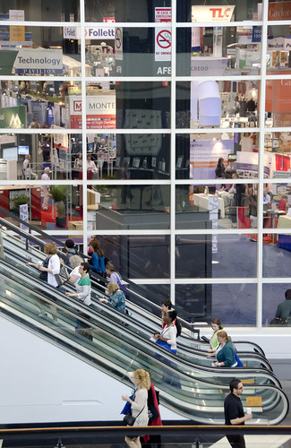
Finally, as usual, I also carved out a bit of time to check out the exhibit hall (which continues to inhibit me with its very vastness).
Conference attendees at McCormick Place with Exhibit Hall in the background


3 Comments on ‘Report from Susan’s Favorite ALA Annual Conference Site’
haha, I knew that comment would keep you on your toes!
Great post, Susan.
I can’t wait to hear assessment ideas! Its clear that we should pay close attention to what our users want before we invest in lots of changes to the library.
All that talk of innovative spaces sends my ideation self into overdrive!