This article is more than 5 years old.
On Monday, April 7, I attended an exhibits workshop sponsored by the Society of North Carolina Archivists at the NC State Library in Raleigh. This workshop was led by three UNC-CH librarians: Linda Jacobson, Andrea Knowlton and Rachel Reynolds.
The day began with a group exercise where we took a variety of containers on our table (ceramic, wood, metal and plastic). My group decided to design an exhibit for children on recycling. The idea for this exercise was that you can design an exhibit using a theme. We came up with our theme, as did everyone else, by looking at an array of dissimilar objects on our table. After sharing our ideas with the group, we moved on. Advanced planning is often necessary as a way to get loaned artifacts in time, to allow time to write the copy and labels and give the opportunity to produce the individual exhibit elements.
The main point of Rachel’s discussion of exhibit labels was: exhibit labels should be written with the audience in mind, not an individual’s colleagues. Labels are best when they are easy to read, and written in simple, direct language. Rachel Reynolds emphasized you should know your key points and make them first in your text (in case the viewer stops reading after the first paragraph). One should avoid technical jargon or expect people to have prior knowledge of people, events or places (apparently the Air & Space Museum has found this out since many current visitors have no memory of the Apollo Space Program). Rachel said you should have one idea per sentence and one subject per paragraph.
Linda Jacobson followed with a short talk focusing on font size for good readability and best color contrasts. We all laughed as one of the following slides had really bad color contrast. Back in our groups, we used an English census record to think about designing an interactive exhibit. Following this discussion, we all designed an exhibit case on paper, complete with photos, text, and captions.

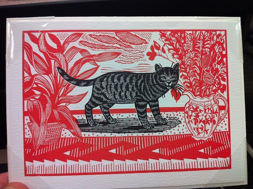
Polyester corners hold this feline print on archival board
In the afternoon session, Andrea Knowlton spoke about the use of approved, acid free and archivally safe materials used in constructing the exhibit. Fact: did you know Mylar is no longer made and has been replaced by a product called Melinex? Believe it! Most exhibits designers now use polyester.
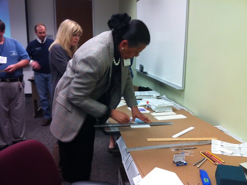
Trimming labels mounted on foam board
We looked at a number of materials used in exhibits such foam board, archival museum board, acrylic mounts, adhesives and polyester strapping. Andrea mentioned light exposure for most library materials is 5-10 foot candles and less for sensitive materials ( wood pulp papers, 19th century photos, watercolors, and colored ink or felt tip pen drawings). Mitigating light damage may be done by using UV sleeves over fluorescent bulbs and UV filters on exterior windows, and of course by using curtains and turning off any lights when possible. Andrea also discussed supports and book cradles. After which, we had an activity in which we made a book cradle and cut labels we put together on foam board. This was a super useful workshop.


3 Comments on ‘Society of North Carolina Archivists Exhibits Workshop’
I would love to see your finished “recycling themed” exhibit. Or did you not get that far? It sounds like a good workshop.
Craig, I like the cat print! (even if the purpose is the show the polyester corners and archival board!) Thanks for posting!
This workshop was tailor-made for you!